wednesday wishlist: sputnik chandeliers

3.26.2014

I think it is obvious to all of us that what I should really be wishing for is more hours in the day! I cannot tell you what a welcomed break blogging is from all of the scrubbing, lifting, unpacking, and organizing that has dictated the last few weeks of my life! I have missed my little blog so much, and I have missed all of you, too (*insert virtual hug and air kisses here*), but--following a third and hopefully final visit from Comcast--I can say with confidence that I am back!

As I write this first post from our new home (!), I am feeling especially excited about what's to come on shell & chinoiserie. Perhaps my excitement is intensified by the paint fumes wafting up to my bedroom (which is still the only room that has a surface for me to sit on), or the gas that lingers in the air from finally having our range installed yesterday (don't tell my husband--I have been enjoying having date night every night.). Or both. But in all honesty, I am so excited to share our progress with you over the next few months...and--as I am learning--more likely, the next few years! However, until I find my USB cable in all of this chaos, unfortunately today's photos will not be of my own home, but instead of other homes which look a lot more beautiful than mine does right now!

In addition to a fresh coat of paint throughout, another quick and easy way I have been updating our new home is by switching out all of the dated light fixtures. One particular fixture is especially effective for taking a home from 1997 (*cough*) to fabulous, and that fixture is the Sputnik Chandelier.

With its burst of space-age shine, the Sputnik is a funky fixture that can add a contemporary touch to an otherwise traditional space, but also translates seamlessly into a spectrum of different decors:


via Bob Vila


Lucent Lightshop on Etsy is a fabulous resource for reasonably priced Sputnik Chandeliers, such as the following:

$375

$299

$199

I may have bought that last one, but I suppose we'll have to wait until I find that darn USB cable to find out for sure! ;-)

monday at madera home

3.10.2014

Before we moved from Boston, we got rid of almost everything. At the time, we figured selling our furniture would be more economical than moving it across the country and then storing it indefinitely. And we were right--it was. But now that we have a new home to furnish, I have switched gears and gone from purging to total shopaholic in under 5. 

It would be the understatement of the century to say that I am beyond excited to decorate our new house, but as excited as I am, the prospect of building back up our collection of furniture and decorative accents can be a bit...daunting?

So far we have bought most of the basics: a sofa, beds, dressers, etc., but the process of filling out in between the basics has only just begun, as I don't want to settle on accessories for the sake of taking up space. Instead, I want to take the time to find unique, meaningful, quality pieces.

And lucky for us, I just so happened to fall upon the mothership of unique, meaningful, quality pieces. And it is called Madera Home.

Madera Home Furniture offers different collections of furniture and home decor that range in style from traditional and antique, to clean and contemporary, so there is something for everyone. The common thread? All are Asian-inspired (bingo!). 

And when I say "Asian-inspired," I mean it. Madera Home's wood workers use reclaimed temple wood from the Qing Dynasty. Yup. Additionally, the resident artisans follow the philosophy of traditional Chinese craftsmanship--but add modern touches--to craft the company's up-cycled "contemporary antique" pieces. Madera Home's Metallic Collection is a shining example of their unique approach:


Most of the collections at Madera Home are a bit more traditional than their Metallic Collection and feature the lost art of hand painting, elegantly executed by the company Resident artist Feng Shan. 

As for much of the original art work featured on the furniture and decorative accents, Madera Home's Serena Strydom explains that the repercussions of China's Cultural Revolution are distinctly visible on some of the pieces, as faces were removed to coincide with Mao Zedong's ideals. "Art for the sake of beauty was discouraged, it was mandated to function as a means to glorify communism," Strydom explains. 

I was captivated by the unique collection comprised of one-of-a-kind pieces and decided to bring a beautiful piece of history into our new home with a pillow box from Madera Home. I chose a box similar to the following, because I am having a major bird moment and thought the colors would compliment our new master bedroom (stay tuned to see it soon!).


When my box arrived, I was pleasantly surprised to see how big it was (a foot long!)! I anticipated it would be big enough to hold a couple of matchbooks or perhaps some earrings, but it is easily big enough to serve as a pretty place to store notecards, photos, and other keepsakes that would otherwise become clutter on my dresser. 

Here are some more of the other beautiful boxes at Madera Home:


In addition to boxes, Madera Home's "Bazaar" collection offers a variety of other smaller decorative accents--including screens, trays and bowls:


If the smaller accents just are not enough, Madera Home has a stunning collection of larger statement furniture:


Imma need a bigger house!

Be sure to visit Madera Home's website to see more of the one-of-a-kind pieces in their extensive collection, and say hello to them if you plan to head to High Point this spring!


a peek at the progress in our new guest bath for the blue & white bash!

3.03.2014

Hello again! My apologies for being so absent lately, but luckily I am back in time for The Pink Pagoda's fourth Blue and White Bash today!

Since my last post, we closed on our new home and I have hit the ground running around like a hen with its head cut-off with repairs and cosmetic updates, a few of which I will show you below, as they are blue and white and bash-appropriate!

This is my fourth time attending one of Jennifer's bashes. If you are a blogger, you too can link-up and share your own post, or if you are a reader, simply sit back and behold all of the beautiful blue and white!


My first time to the bash I brought a recreation of a blue and white room by Meg Braff, the second time I brought some blue and white ways to decorate for Christmas, and last month I brought extra seating to the party with some blue and white bistro chairs.

But this month I am beyond excited to finally reveal the very first glimpse into our new home, which we are not yet living in as it undergoes the updates...but we are getting close!

In the meantime, my spring fever has continued to intensify over the past few weeks, as lately here in the Lowcountry, we have been teased with warm days in between the cold ones. Of course, we all know that one way to enjoy an endless summer is with decor and I believe a bathroom is the perfect place to recreate a little bit of the beach.

The following are a few examples of blue and white beachy bathrooms that I love:


I have always loved having a bathroom that evokes fond memories and feelings of the beach with blue and white accents, as well touches of as sand, shells or sea glass. I think that--much like the beach--a bathroom should be a relaxing retreat. The following two photos are from our last rental apartment in Boston, where I tried my best to make the bathroom tolerable by adding some beachy accents, but as you can see, I didn't have much to work with!:


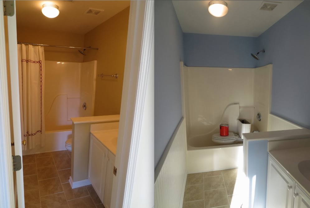
Fast forward about a year to the next two photos, which were taken two weeks ago of the guest bath in our new home!:


Yeesh! Those blah, brown walls were horrid! I don't mind the tile as much, as it is the same color as sand and can be complimentary to the coastal look I want to achieve. 

As for the more permanent features in the room, I would love to replace the vanity with a pretty pedestal sink, but this bathroom will one day belong to our future children and if they are anything like their mother, they gonna need some storage! Regardless, I am sure I can find a prettier vanity that offers just as much storage space...when I have the budget. In the meantime, a little paint can make a big change--and be affordable!--so that is where I began.

One blue and white bathroom accent of ours that I love is our Regatta Stripe shower curtain from Garnet Hill, to which I referred for color inspiration in the new guest bath:


So I took a trip to Sherwin-Williams (my new home away from my new home) and painted a few samples on the wall:


And despite the awful lighting, I was able to pick one fairly quickly (unlike in our master bedroom, but that is a post for another day)! The color I chose was Blissful Blue:


But before the painting began, my wonderful contractor took the existing eyesore of a mirror down and added some beautiful wainscoting and beadboard to dress-up the bathroom a bit. And he put the potty in the tub. Then my very-patient painters (another reference to the master bedroom "incident") began priming...


...and as always, it looked worse before it looked better...


But here is the beginning to our beautiful blue and white guest bathroom now!:


Clearly is still has a long way to go (the potty is still in the tub), but I think we achieved a solid start!

So the next step will be accessorizing! Here are some of the beachy accents I am considering to complete the look for our guest bath:

source unknown via Completely Coastal blog


via Country Living

Just one of many potential outcomes:


I will keep you updated about the bathroom and hopefully it will be ready for it's big debut by The Pink Pagoda's next Blue and White Bash! In the meantime, feel free to give me some of your guidance with the bathroom accessories!

Also be sure to follow along next month as I work on another room in our new home for Calling It Home's One Room Challenge Linking Party!
 
Blogging tips